
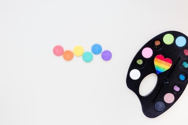
Understanding the Color Wheel
The color wheel is a visual guide organizing colors in a circle to show relationships and interactions. It helps understand how colors mix and create various hues, providing structure for color theory discussions and practical applications in art and design. This tool allows for predictable mixing paths and useful conclusions about color harmony.
Primary Colors
In the realm of color theory, primary colors hold a fundamental position, serving as the building blocks from which all other colors are derived. These foundational hues cannot be created by mixing other colors together; rather, they form the basis for the creation of a vast spectrum of shades and tints. The classic primary colors are red, yellow, and blue, although variations exist depending on the color model used (such as RYB for traditional pigment mixing and RGB for additive color mixing in digital displays). Understanding the properties of primary colors is crucial for predicting how they will interact when combined, a key aspect of color mixing.
The intensity and saturation of primary colors significantly influence the results of color mixing. Different shades of red, yellow, and blue will yield diverse secondary and tertiary colors. For instance, a warm red will produce a noticeably different orange when mixed with yellow compared to a cooler red. This sensitivity highlights the importance of selecting specific primary color variations to achieve desired results in mixing; The selection of primary colors also depends on the medium. Paints, for example, often use a different set of primaries than digital screens.
Experimentation with various shades and combinations of primary colors is essential for developing a strong grasp of color mixing principles. This hands-on approach allows artists and designers to refine their understanding of how these fundamental hues interact and behave, enabling them to produce desired color outcomes with greater precision and control. The depth of color understanding gained through practice is invaluable in any creative endeavor involving color.
Secondary Colors
Secondary colors, vibrant and expressive, arise from the harmonious blending of two primary colors. These intermediate hues bridge the gap between the foundational primaries, expanding the palette of possibilities for artists and designers. Green, a secondary color, emerges from the careful union of blue and yellow. Orange, a warm and energetic hue, is the product of red and yellow’s combination. Purple or violet, a regal and mysterious color, results from the fusion of red and blue. The precise shades of these secondary colors are highly dependent on the specific proportions and shades of the primary colors used in their creation.
The ratios of primary colors used in the mixing process significantly influence the resulting secondary color. A greater proportion of one primary over the other will shift the resulting secondary color towards that primary hue. For instance, a greater proportion of blue in a blue-yellow mix will result in a bluer green. This principle extends to the creation of all secondary colors, emphasizing the importance of precise measurements and observation during the color mixing process. The level of saturation also varies with the ratio of primaries, impacting the vibrancy of the secondary color.
Understanding the relationships between primary and secondary colors is fundamental to effective color mixing. Mastering the creation and manipulation of secondary colors unlocks a wider range of color options, allowing for a more diverse and expressive palette. This knowledge empowers artists to create complex and nuanced color schemes with greater precision and confidence, enhancing their creative output significantly.
Tertiary Colors
Tertiary colors, often overlooked yet incredibly versatile, occupy the spaces between primary and secondary colors on the color wheel. These nuanced hues add depth and complexity to color palettes, offering a bridge between the boldness of primaries and the richness of secondaries. They are created by mixing a primary color with its adjacent secondary color, resulting in a subtle shift in hue. For example, red-orange, a warm and energetic tertiary, results from mixing red and orange. Similarly, blue-green, a cool and calming tertiary, is formed by combining blue and green. Yellow-green, a vibrant and lively tertiary, is produced by mixing yellow and green.
The subtle variations in hue offered by tertiary colors provide artists with a wider range of expressive possibilities. They allow for the creation of more refined and sophisticated color schemes, moving beyond the simplicity of primary and secondary combinations. The delicate balance between primary and secondary influences in tertiary colors lends itself to creating subtle gradients and transitions in color, adding depth and visual interest to artworks. These nuances are especially valuable in areas such as fashion design, graphic design, and painting, where subtle shifts in hue can significantly impact the overall aesthetic.
Experimenting with tertiary colors is crucial for developing a comprehensive understanding of color mixing. Their creation requires a keen eye for proportion and a sensitivity to the subtle shifts in hue that result from mixing primary and secondary colors. Mastering the use of tertiary colors allows artists to achieve greater control over their color palettes, leading to more nuanced and impactful results in their creative endeavors. The subtle variations in hue offered by tertiary colors enrich the possibilities of color expression.
Color Mixing Techniques
Understanding color mixing is key to unlocking creative potential. This involves blending primary, secondary, and tertiary colors to achieve desired hues. Experimentation and practice lead to mastery of color interactions and the creation of unique shades.
Mixing Primary Colors
Primary colors, typically red, yellow, and blue, are the foundational hues from which all other colors are derived. These colors cannot be created by mixing other colors together; they are the purest forms. Mixing primary colors in various proportions allows for the creation of a wide spectrum of secondary and tertiary colors. For instance, combining red and yellow produces orange, a warm and vibrant secondary color. Mixing red and blue results in purple, a cool and sophisticated secondary hue. The combination of yellow and blue creates green, a color often associated with nature and tranquility. The ratios of each primary color significantly impact the resulting color’s hue and saturation. A greater proportion of one primary color will influence the final mix more strongly. For example, a mixture heavily weighted towards red and yellow will produce a more reddish-orange than an even mix of the two primaries. Experimentation and careful observation are key to mastering the art of mixing primary colors to achieve precise and desired outcomes. The color wheel serves as an invaluable guide in this process. Understanding how primary colors interact is crucial for building a strong foundation in color mixing and color theory. Precise measurements are not always essential; the process often involves intuitive adjustments based on visual assessment.
Mixing Secondary Colors
Secondary colors are created by mixing two primary colors in equal proportions. These colors, orange (red and yellow), green (blue and yellow), and purple (red and blue), form the foundation for a broader range of color possibilities. Mixing secondary colors with each other or with primary colors introduces further complexity and nuance. For instance, mixing green (a secondary) with blue (a primary) creates a bluer-green, while adding yellow to green shifts the hue towards a more yellowish-green. The ratios of the secondary colors significantly impact the resulting hue and saturation. A mixture heavily weighted towards one secondary color will strongly influence the final mix. For example, combining a larger proportion of green with a smaller amount of purple will result in a greenish-purple, rather than a true neutral. Understanding the interaction between secondary colors unlocks further creative potential. Experimentation is vital in achieving desired shades. The color wheel aids in visualizing these relationships and predicting outcomes. While theoretical ratios provide a starting point, adjustments based on visual observation are crucial for achieving precise color matches. Through careful mixing and experimentation, artists can achieve a wide spectrum of colors using just secondary hues and their combinations.
Mixing Tertiary Colors
Tertiary colors, also known as intermediate colors, are produced by mixing a primary color with an adjacent secondary color. This creates six new colors situated between the primary and secondary colors on the color wheel. For example, mixing red (primary) and orange (secondary) yields a red-orange; mixing blue (primary) and green (secondary) produces a blue-green. These tertiary colors possess characteristics of both their parent colors. A red-orange will share the warmth of red and the brightness of orange, while a blue-green will exhibit the coolness of blue and the calmness of green. The precise hue of a tertiary color is directly influenced by the ratio of primary and secondary colors used. A greater proportion of primary will result in a color closer to the primary hue. Conversely, a larger quantity of secondary will shift the color towards the secondary. Tertiary color mixing allows for a greater range of nuanced shades beyond the primary and secondary colors. This process provides a richer palette for artists and designers. The subtle shifts in hue resulting from varying the proportions of primary and secondary colors in the mix are almost limitless. Mastering tertiary color mixing enhances the artist’s ability to create sophisticated and unique color combinations, significantly expanding creative expression;
Color Harmony
Color harmony refers to the pleasing visual combinations of colors. The color wheel is key to understanding harmonious color schemes, such as complementary, analogous, and triadic pairings, crucial for creating visually appealing designs.
Complementary Colors
Complementary colors are pairs of colors located directly opposite each other on the color wheel. These pairings, such as red and green or blue and orange, create a high degree of contrast. When placed side-by-side, they produce vibrant and visually striking effects. The strong contrast makes complementary colors excellent for creating eye-catching designs and artwork. However, using them in large quantities can sometimes be overwhelming to the eye.
Understanding how complementary colors interact is crucial for effective color mixing and achieving desired aesthetic outcomes. In painting, for instance, a small amount of a complementary color can be added to another color to enhance its vibrancy or create a more nuanced tone. The strategic use of complementary colors is a hallmark of many artistic styles across various mediums, from fine art to graphic design.
The key to successfully employing complementary colors lies in achieving a balance. While the high contrast they offer is visually engaging, excessive use can create a jarring effect. Often, artists and designers use one color as a dominant hue, while the complementary color serves as an accent or a secondary element in the composition. This careful balancing act ensures that the visual impact is both striking and harmonious, rather than chaotic or overwhelming. Mastering the use of complementary colors is a significant step in developing a strong understanding of color theory and its practical applications.
Analogous Colors
Analogous colors are groups of three colors that are adjacent to each other on the color wheel. Unlike complementary colors which offer high contrast, analogous colors create a harmonious and subtle effect due to their close proximity. This creates a sense of visual unity and tranquility, making them a popular choice for creating calming and balanced designs. Think of a sunset, with its blend of oranges, reds, and yellows – a classic example of analogous color harmony.
The subtle shifts in hue within an analogous color scheme make them ideal for creating smooth transitions and gradients. This quality is particularly useful in various design applications, such as interior decorating, where a gentle shift from one color to another can establish a cohesive and relaxing atmosphere. In painting, analogous colors can be used to create depth and dimension, subtly guiding the viewer’s eye across the canvas.
However, the very harmony that makes analogous colors appealing can also present a challenge. Because of their similar hues, it can be more difficult to create a strong focal point in a design using only analogous colors. Careful attention to value and saturation is needed to avoid a monotonous or bland effect. Often, artists and designers introduce a contrasting element, perhaps a small amount of a complementary color, to add visual interest and prevent the composition from becoming too passive.
Triadic Colors
Triadic color schemes utilize three colors evenly spaced around the color wheel, forming an equilateral triangle. This arrangement provides a vibrant and visually striking combination, offering a balance between harmony and contrast. The inherent diversity of a triadic scheme allows for dynamic compositions, ensuring visual interest without overwhelming the viewer. Examples include red, yellow, and blue (the primary colors) or orange, green, and violet (the secondary colors). The specific hues chosen will significantly impact the overall mood and feel of the final artwork or design.
The strength of a triadic scheme lies in its ability to create a lively and energetic effect. The colors complement and contrast each other simultaneously, leading to a visually stimulating experience. This makes triadic color schemes particularly useful for projects requiring a bold and attention-grabbing aesthetic. They are frequently seen in branding and advertising where a strong visual impact is desired to capture the viewer’s attention.
However, achieving balance in a triadic scheme requires careful consideration of value and saturation. An overly saturated triadic combination can feel jarring or overwhelming, while uneven values might lead to a visually unbalanced composition. Mastering the nuances of triadic harmonies involves experimenting with variations in shade, tint, and tone to create a cohesive and pleasing aesthetic. Proper use of these variations can transform a potentially chaotic combination into a harmonious and striking visual masterpiece.